Data visualization
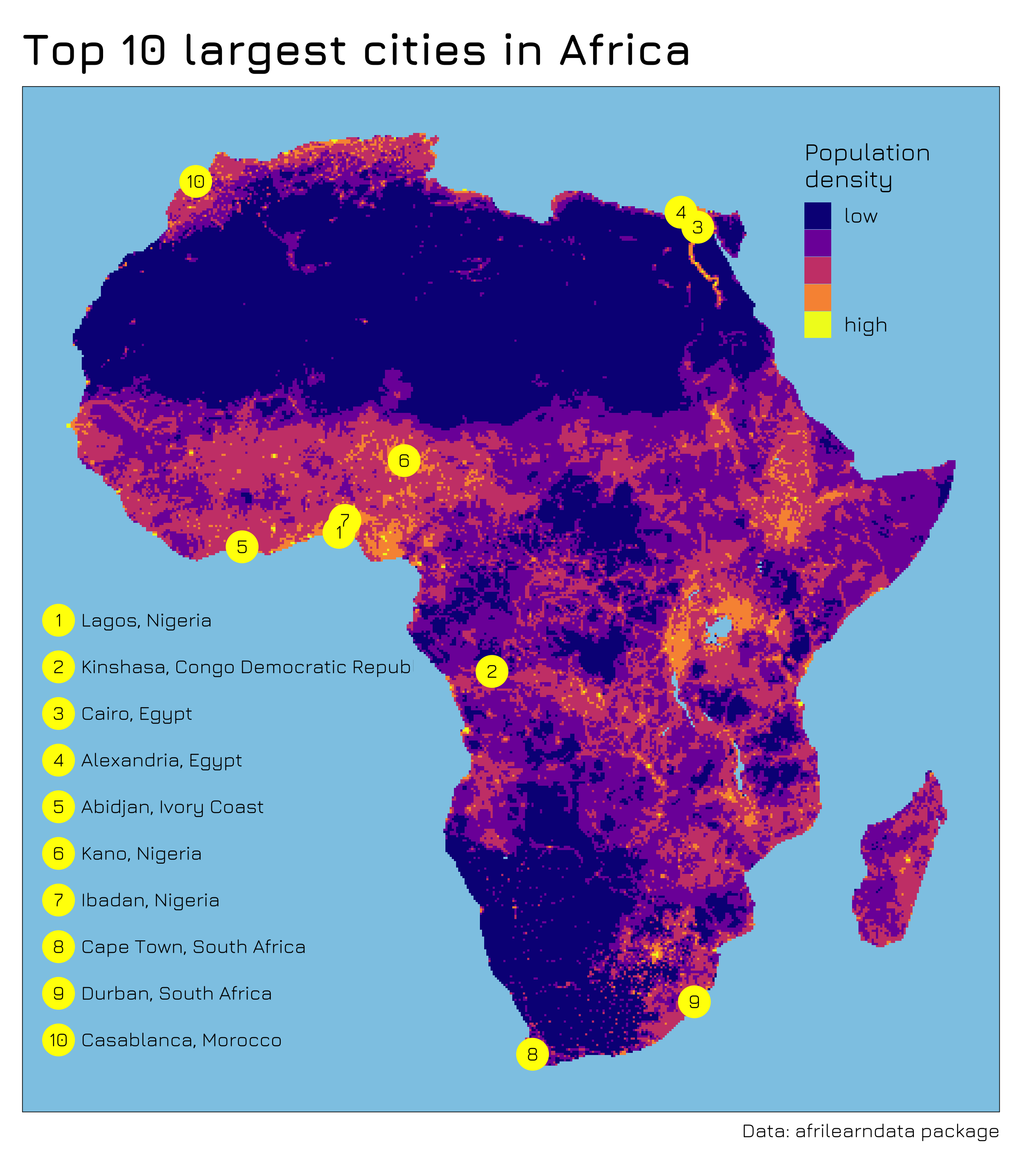
#30DayMapChallenge 2021
For the second time I participated in the 30DayMapChallenge for the thirty days of November 2021. I managed to create 24 out of the 30 maps, enjoyed a lot what people shared on Twitter and learned many new cool things. In this blogpost I want to share some thoughts and learnings.
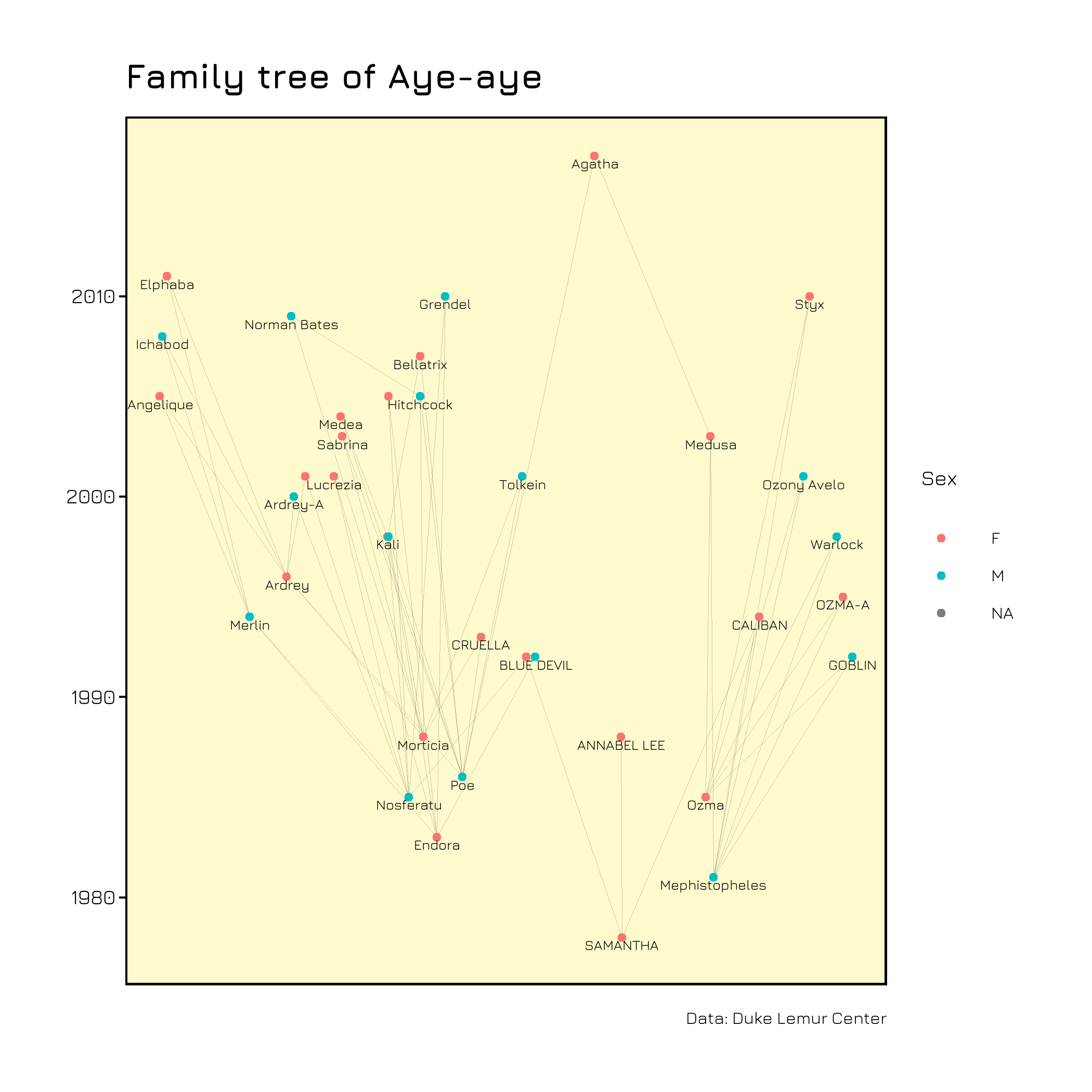
Family trees with ggraph
Networks can be useful when visualizing family trees. I explored the possibilities of doing this with the {ggraph} package for family information of Lemurs for #TidyTuesday. In this blogpost I describe step by step how to create the visuals.
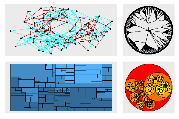
First steps with ggraph
The {ggraph} packages allows to visualize networks and hierarchical data in beautiful ways. In this post I would like to show in which format your data has to be so that ggraph does what you want it to do.
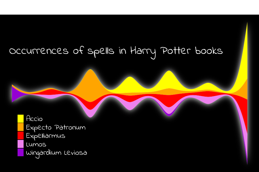
What I learned: #30DayChartChallenge
During the whole month of April I participated in the #30DayChartChallenge, organized by Cédric Scherer and Dominic Royé. Looking for suitable data, pre-processing, choosing a type of visualization and finally trying to make it as beautiful as possible - for 30 days, every day. I learned so many new cool things and would like to share a few of them here.
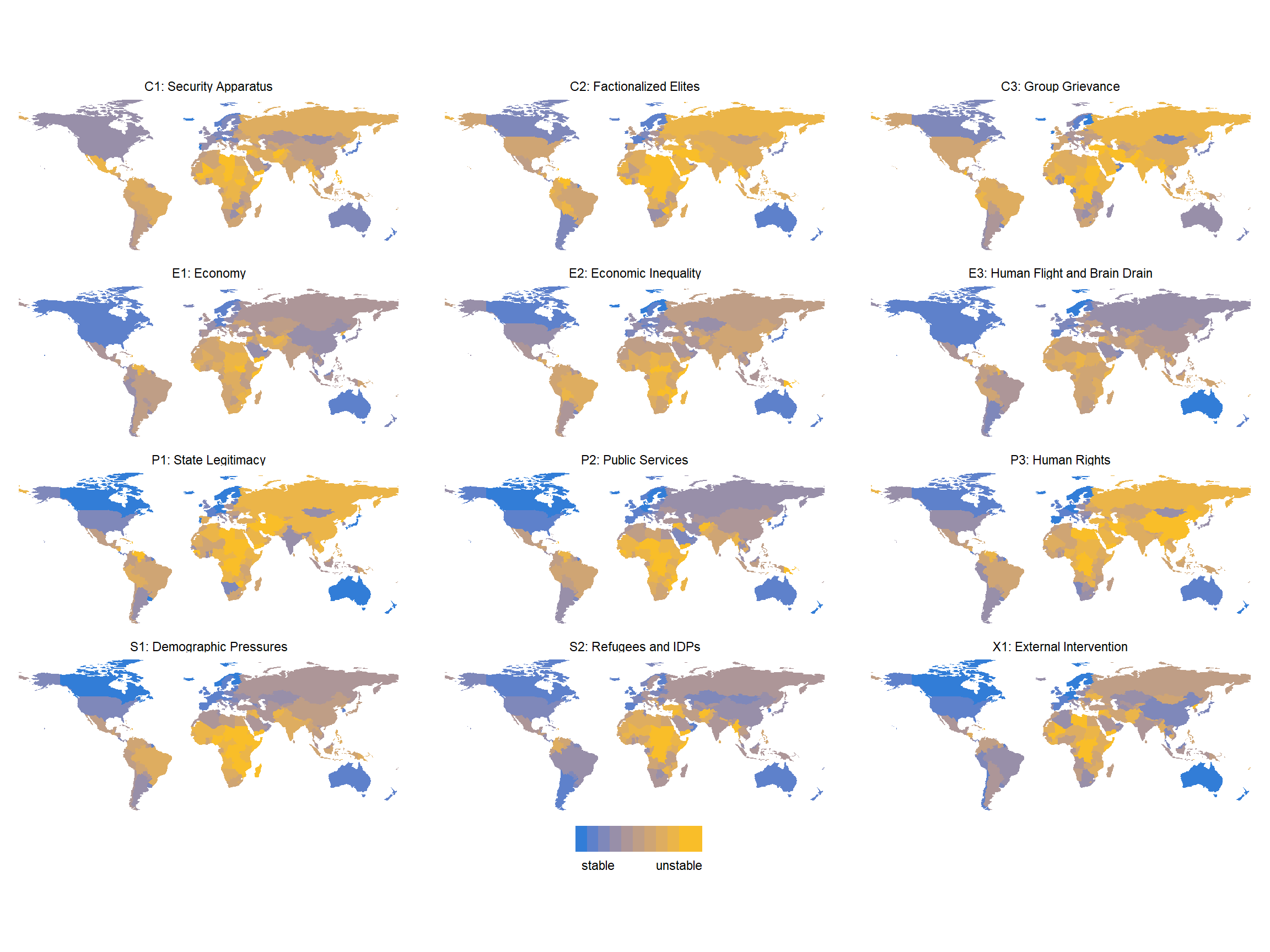
The Fragile State Index
One of the most interesting datasets I looked at recently is The Fragile State Index. It is a project dedicated to measure risk and vulnerability in countries worldwide, assigning values to 12 indicators like economic inequality, demographic pressures and brain drain (the tendendy of intellectuals and politicians to leave the country). The project is powered by The Fund For Peace and the data is publicly available.
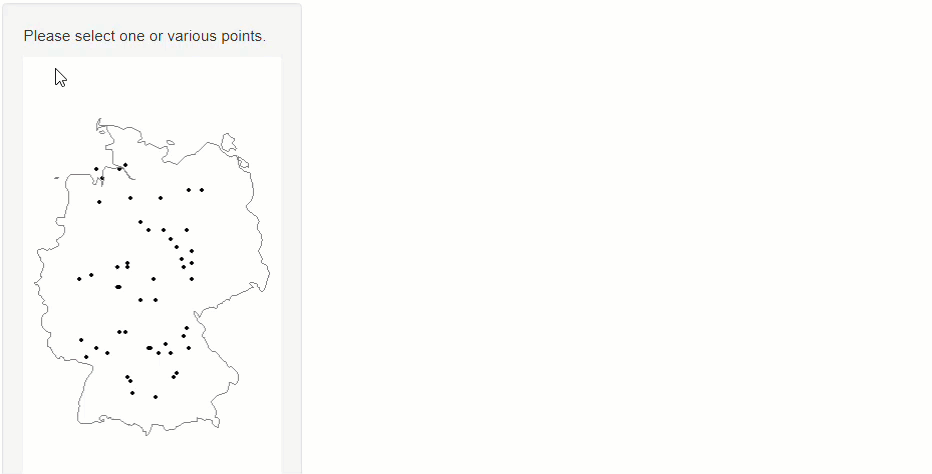
Select points on maps
When you want to show spatial data with additional information for each data point you can use shiny for interactive exploration.
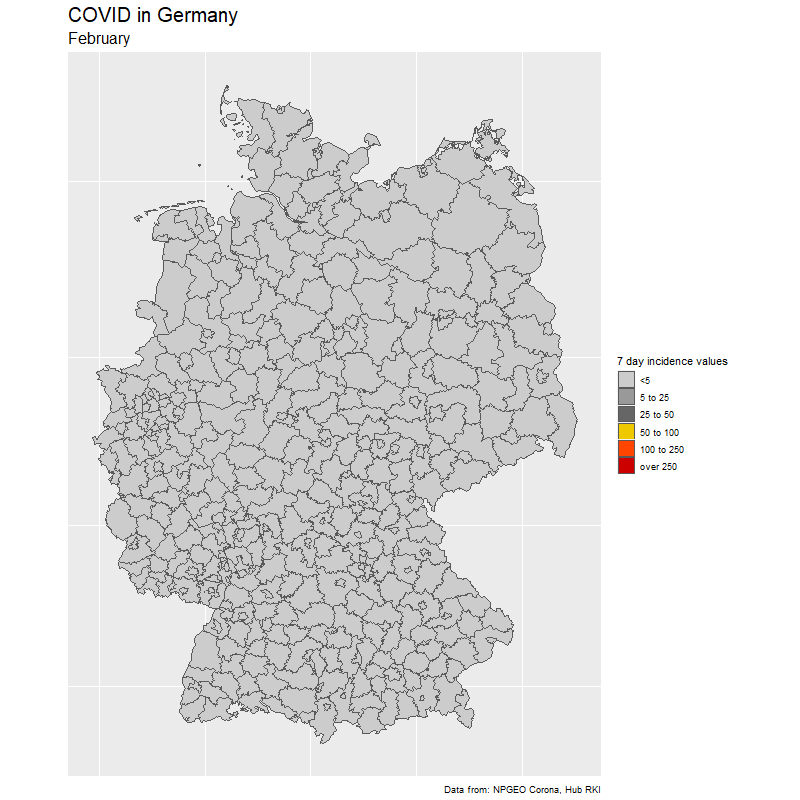
Tracking COVID in Germany
Animations can help to show events over time. I found data from the RKI about daily COVID cases in Germany and want to describe the process of creating the animation. It involves fuzzy matching, as the names of the counties (Landkreise) are not identical in the RKI data and the shapefile I used.
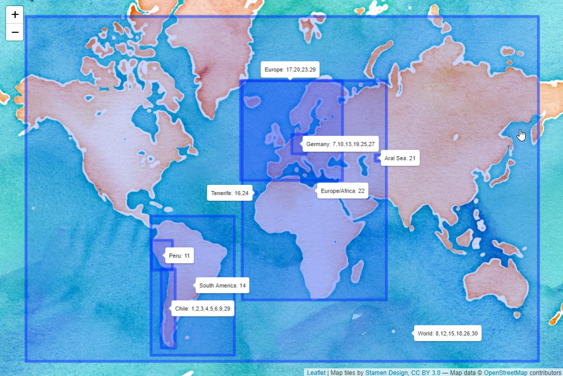
What I learned: #30DayMapChallenge
During November 2020 I participated in the 30DayMapChallenge, initiated by Topi Tjukanov. I created 30 maps according to the daily topics and want to summarise what I learned in this blogpost.