ggraph
I recently tried out {ggraph} by Thomas Lin Pedersen and think it is a great tool to add to one’s data visualization toolbox. This package allows to create networks and all kinds of cool plots with hierarchical data.
While I am quite familiar with ggplot (still have to google a lot, but I know what I have to do to get from data to a desired output), it took some time to understand the logic behind ggraph. The good news is: It is similar to ggplot, so the plot is created with a layer-like grammar which converts the raw data in one of these beautiful visualizations.
More information at the package’s website.
Packages
We will need the following packages.
Mini example
The data for ggplot graphs is a dataframe or a tibble. For ggraph, we are working with networks and therefore need two components:
- Vertices / Nodes
- Edges
The edges define the connections between the nodes. And if we do not pass along any information with the nodes, it is enough to define a dataframe with edges.
Let’s take a look at a mini example:
edges <- data.frame(
  from = c("father", "father", "father", "mother", "mother", "mother"),
  to = c("me", "sister1", "sister2", "me", "sister1", "sister2")
)
We had to load the {igraph} package in the beginning as it contains the function which converts this to a graph.
g <- graph_from_data_frame(edges)
And this graph is used to visualize this small example:
ggraph(g) +
  geom_edge_link() +
  geom_node_text(aes(label = name))
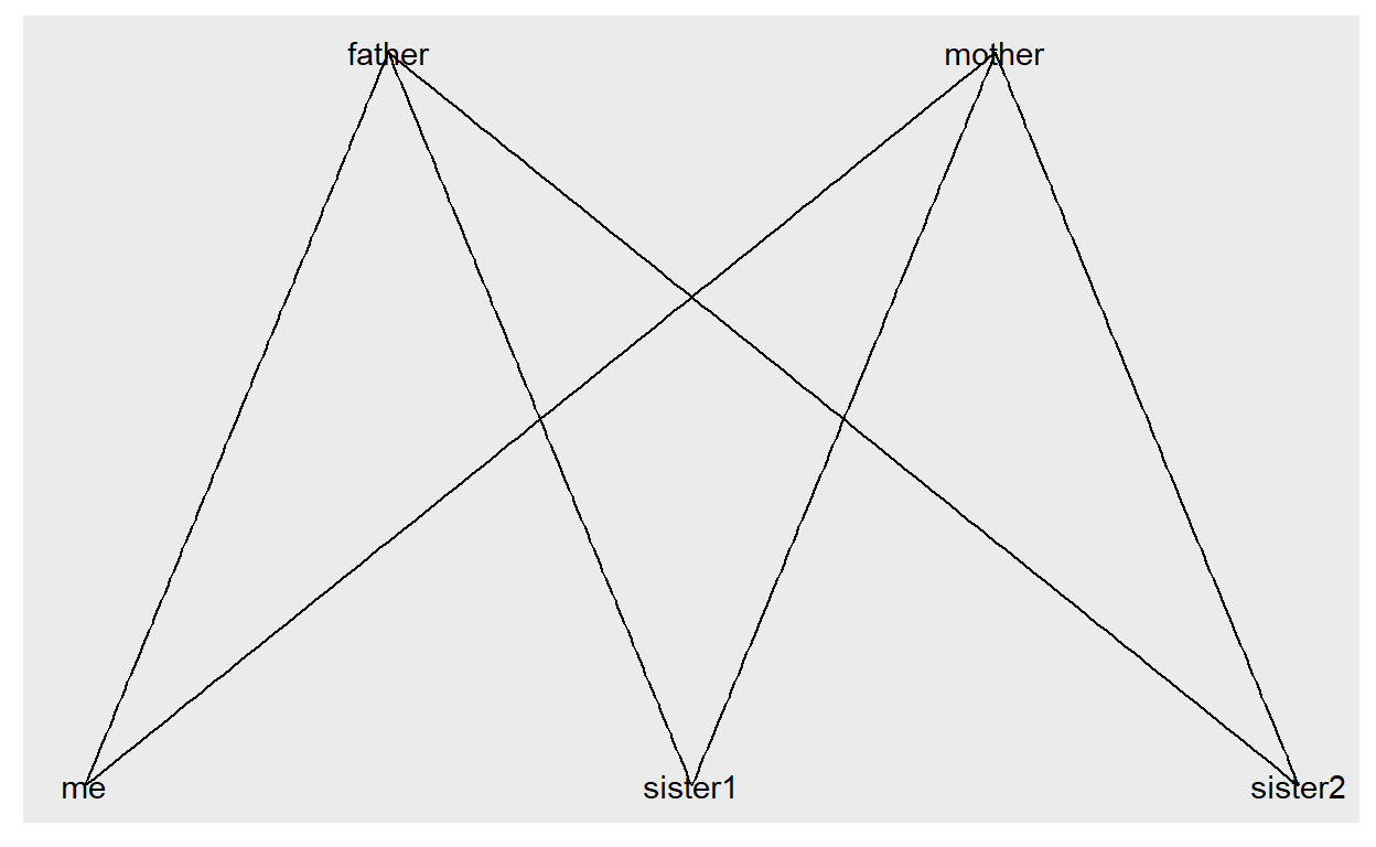
This is a very small example. The next step would be to add information to the nodes. So far the nodes have been created from the edges by using the names appearing in the columns from and to (by the way: you can name them as you like and even add further columns - the first two columns will always indicate from which node to which node a line has to be drawn).
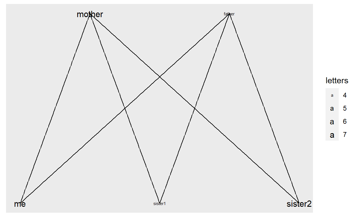
We can also do this manually:
vertices <- data.frame(name = c("mother", "father", "me", "sister1", "sister2"),
                       letters = c(7, 4, 7, 4, 7))
g <- graph_from_data_frame(edges, vertices = vertices)
ggplot2 users will be happy to hear that dealing with sizes, colors etc. is the exact same logic, you just have to add scale_edge_... when you refer to edges.
ggraph(g) +
  geom_edge_link() +
  geom_node_text(aes(label = name, size = letters)) +
  scale_size_continuous(range = c(2,4))
Enough with the basics, let’s look at real data.
Real-world examples
The data stems from the Global Health Data Exchange website and you can customize the data download. It is really worth a visit, and contains country-level data around the Burden of Diseases, broken down by sex, age-group and year (1990 - 2019).
For this example I downloaded a subset containing the percentage of different death causes per country in 2019.
| location | cause | val |
|---|---|---|
| Armenia | Encephalitis | 0.000533832 |
| Greece | Neonatal disorders | 0.001085751 |
| Chad | Non-Hodgkin lymphoma | 0.001367366 |
| Honduras | Other transport injuries | 0.001786898 |
| Indonesia | Maternal disorders | 0.003084283 |
| South Sudan | Diphtheria | 0.000201279 |
| Oman | Esophageal cancer | 0.002769811 |
| Slovenia | Stroke | 0.098549024 |
| Bolivia (Plurinational State of) | Bladder cancer | 0.002728930 |
| Switzerland | Bacterial skin diseases | 0.001770625 |
The dataset contains 133 death causes and which percentage of total deaths they had in 2019 in each one of 213 countries.
Making a treemap
First, we will try to make a treemap to show each country’s profile. For this, we will need some hierarchy. It took some manual work for me to get the hierarchical data from the website (which groups together certain death causes into higher level families).
The file will be on the second sheet of the excel file in this blogpost’s repository.
| Cause | CauseL2 | CauseL3 |
|---|---|---|
| Diarrheal diseases | Enteric infections | Communicable, maternal, neonatal, and nutritional diseases |
| Cysticercosis | Neglected tropical diseases and malaria | Communicable, maternal, neonatal, and nutritional diseases |
| Falls | Unintentional injuries | Injuries |
| Pneumoconiosis | Chronic respiratory diseases | Non-communicable diseases |
| Adverse effects of medical treatment | Unintentional injuries | Injuries |
| Self-harm | Self-harm and interpersonal violence | Injuries |
We will join the two datasets and filter out a country of interest.
country <- "Chile"

graph_data <- df %>%
  filter(location == country) %>%
  inner_join(causes, by = c("cause" = "Cause"))
In the introduction, we were dealing with networks, here we are dealing with hierarchical data, but the idea is the same: We will create edges between higher level and lower level features. In our case we have three levels and thus will create connections between Level 3 and Level 2 and then between Level 2 and Level 1.
Exactly as in our mini example, the edges data.frame will have two columns (from and to).
edges <- graph_data %>%
    distinct(from = CauseL3, to = CauseL2) %>%
    rbind(graph_data %>%
            distinct(from = CauseL2,
                     to = cause))
Similarly, we will do for the vertices. In theory, the vertices would just require the names of all causes from the three levels. We cannot have vertices with a value of 0 (unless we would remove them from the edges), so I am setting those to a very small value.
In this code I am adding a few extra columns which will help to create a better visual:
- I am adding the parent names (from the higher levels) as I will need those for coloring later.
- And I will add a new column called
level, so that not all the labels are displayed, but just the level 1 labels. This is stored innew_labelat the end of the code. - I removed all but the top 10 causes of death in a country, to make the plot less cluttered, but this can be easily changed in the last
mutate.
vertices <- graph_data %>%
    select(name = cause, val = val, parent = CauseL2, parent2 = CauseL3) %>%
    mutate(val = pmax(val, 0.000001), level = 1) %>%
    rbind(graph_data %>%
            distinct(name = CauseL2, parent = CauseL3, parent2 = NA) %>%
            mutate(val = 0, level = 2)) %>%
    rbind(graph_data %>%
            distinct(name = CauseL3, parent = NA, parent2 = NA) %>%
            mutate(val = 0, level = 3)) %>%
    mutate(rank = rank(-val, ties.method = "first"),
      new_label = ifelse(level==1 & rank <= 10, name, NA)) %>%
    distinct(name, val, level, new_label, parent, parent2)
Let’s have a look at the data of the vertices:
| name | val | parent | parent2 | level | new_label |
|---|---|---|---|---|---|
| Chronic kidney disease | 0.044547825 | Diabetes and kidney diseases | Non-communicable diseases | 1 | Chronic kidney disease |
| Decubitus ulcer | 0.002074525 | Skin and subcutaneous diseases | Non-communicable diseases | 1 | NA |
| Cardiovascular diseases | 0.000000000 | Non-communicable diseases | NA | 2 | NA |
| Foreign body | 0.001681691 | Unintentional injuries | Injuries | 1 | NA |
| Cardiomyopathy and myocarditis | 0.007762194 | Cardiovascular diseases | Non-communicable diseases | 1 | NA |
| Falls | 0.013177099 | Unintentional injuries | Injuries | 1 | NA |
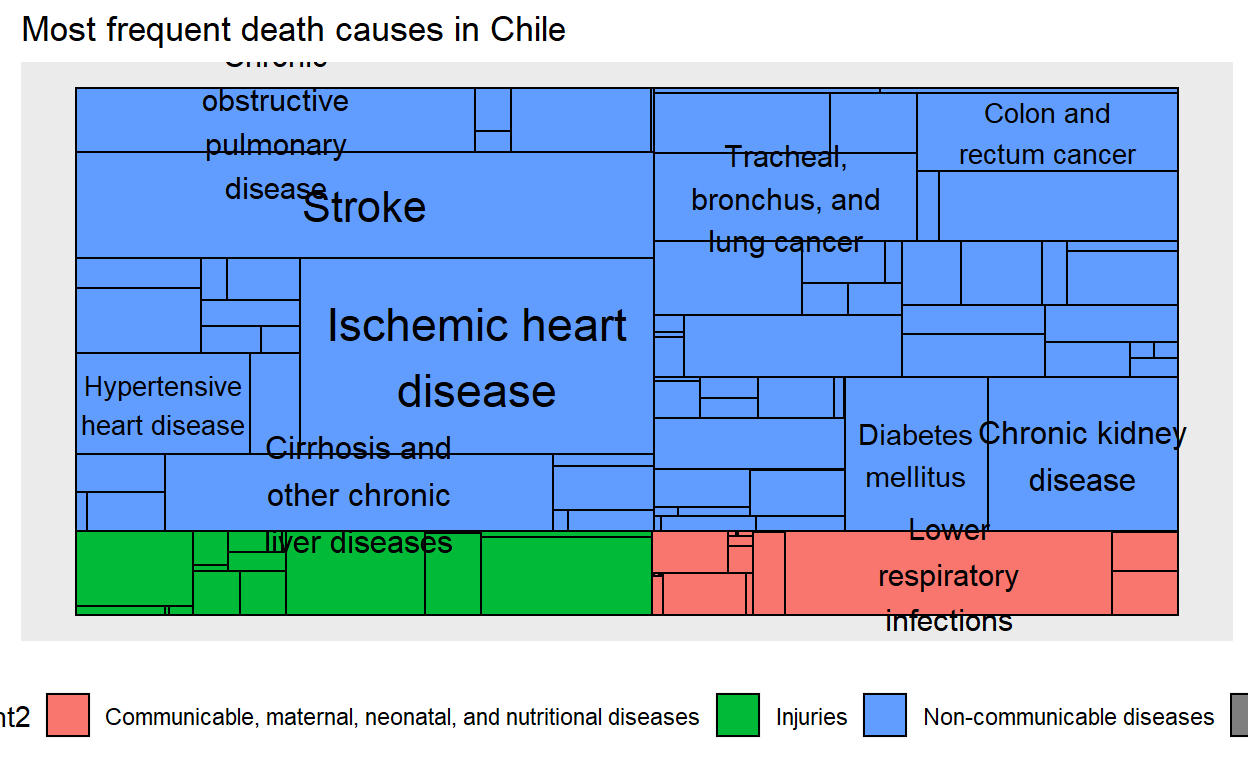
Good! We are ready to take a look at our graph. Some of the causes have very long names, so I use str_wrap from {stringr} to cut them into several lines. You can also replace that part by new_label and all label will appear as they are.
graph <- graph_from_data_frame(edges, vertices = vertices)

ggraph(graph, 'treemap', weight = val) +
    geom_node_tile(aes(fill = parent2)) +
    geom_node_text(aes(label = stringr::str_wrap(new_label,15), size = val)) +
    guides(size = FALSE) +
    labs(title = paste("Most frequent death causes in", country)) +
    theme(legend.position = "bottom")
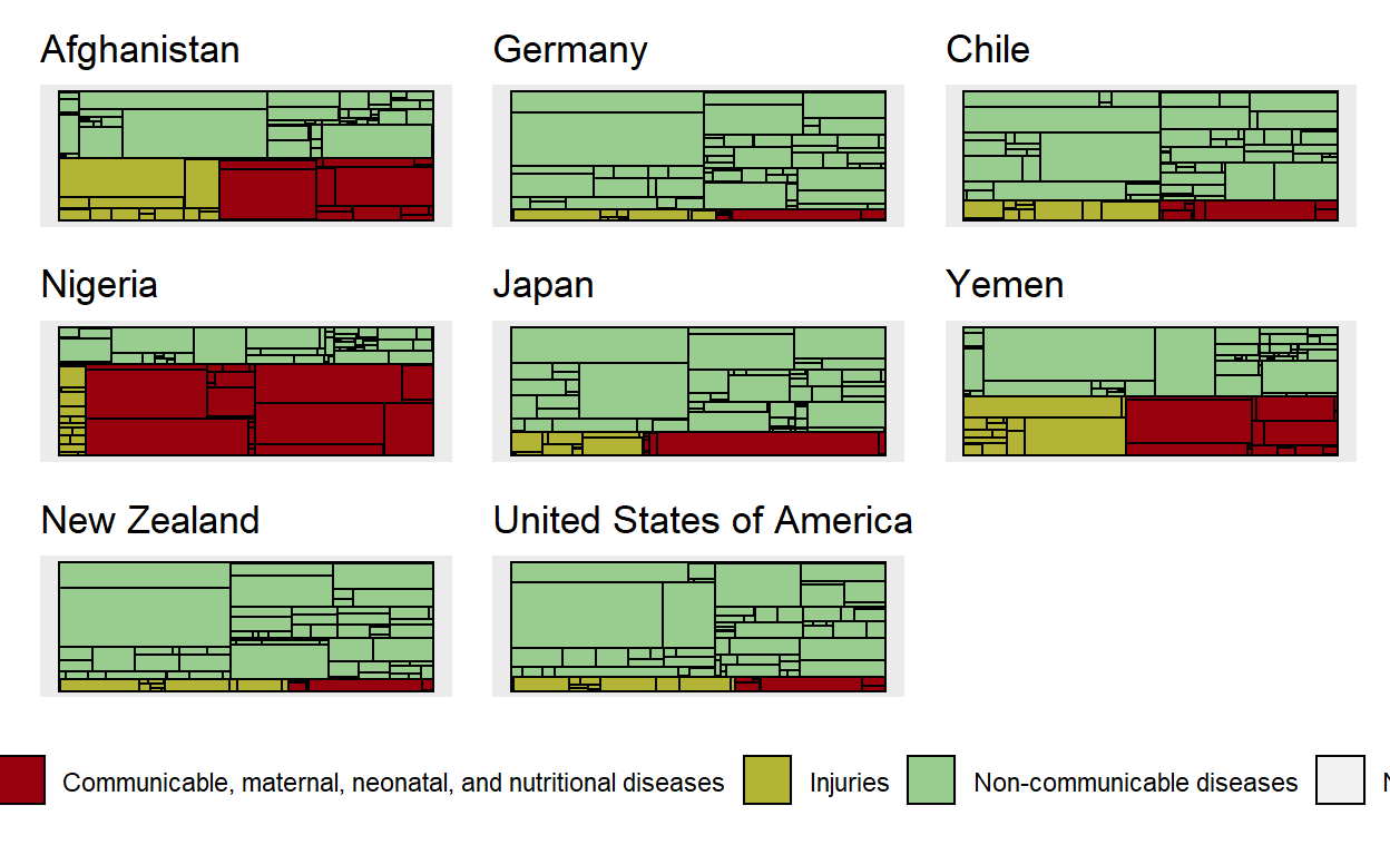
Let’s put all of the above in a function and call it get_country_profile. Then we can easily create profiles for several countries and compare them. You can unhide the code if you want to see the final function.
get_country_profile <- function(country) {

  graph_data <- df %>%
    inner_join(causes, by = c("cause" = "Cause")) %>%
    filter(location == country)

  edges <- graph_data %>%
    distinct(from = CauseL3, to = CauseL2) %>%
    rbind(graph_data %>%
            distinct(from = CauseL2,
                     to = cause))

  vertices <- graph_data %>%
    select(name = cause, val = val, parent = CauseL2, parent2 = CauseL3) %>%
    mutate(val = pmax(val, 0.000001), level = 4) %>%
    rbind(graph_data %>%
            distinct(name = CauseL2, parent = CauseL3, parent2 = NA) %>%
            mutate(val = 0, level = 3)) %>%
    rbind(graph_data %>%
            distinct(name = CauseL3, parent = country, parent2 = NA) %>%
            mutate(val = 0, level = 2)) %>%
    mutate(rank = rank(-val, ties.method = "first"),
      new_label = ifelse(level==4 & rank <= 3, name, NA)) %>%
    distinct(name, val, level, new_label, parent, parent2)

  graph <- graph_from_data_frame(edges, vertices = vertices)

  ggraph(graph, 'treemap', weight = val) +
    geom_node_tile(aes(fill = parent2)) +
    #geom_node_text(aes(label = stringr::str_wrap(new_label,15), size = val)) +
    guides(size = FALSE) +
    harrypotter::scale_fill_hp_d(option = "HarryPotter") +
    labs(title = country)

}


p1 <- get_country_profile("Afghanistan")
p2 <- get_country_profile("Germany")
p3 <- get_country_profile("Chile")
p4 <- get_country_profile("Nigeria")
p5 <- get_country_profile("Japan")
p6 <- get_country_profile("Yemen")
p7 <- get_country_profile("New Zealand")
p8 <- get_country_profile("United States of America")


library(patchwork)


p1 + p2 + p3 + p4 + p5 + p6 + p7 + p8 + plot_spacer() +
  plot_layout(guides = "collect") &
  theme(legend.title = element_blank(),
        legend.position = "bottom")
Creating a network
If you feel that doing the manual step of creating the dataframes for edges and vertices is too much, you might be happy to hear that you can create great networks without doing that step manually.
For this we will additionally need the package {widyr}.
This package allows for pairwise comparisons between countries.
all_sim <- df %>%
  pairwise_similarity(location, cause, val, upper = FALSE) %>%
  filter(similarity > 0.95)
| item1 | item2 | similarity |
|---|---|---|
| Kenya | Zimbabwe | 0.9597491 |
| Czechia | High-middle SDI | 0.9630934 |
| Iran (Islamic Republic of) | Iraq | 0.9664777 |
| Tokelau | Saint Vincent and the Grenadines | 0.9611687 |
| France | Belgium | 0.9760450 |
| Botswana | Eswatini | 0.9914667 |
| Switzerland | Iceland | 0.9816005 |
| Vanuatu | Palestine | 0.9575626 |
| Kazakhstan | Turkmenistan | 0.9623283 |
| Kyrgyzstan | Libya | 0.9519206 |
net <- all_sim %>%
  graph_from_data_frame()
net %>%
  ggraph(layout="fr") +
  geom_edge_link(aes(edge_alpha = similarity)) +
  #geom_node_point() +
  geom_node_text(aes(label=name), size = 2, col = "red",
                 check_overlap = TRUE)
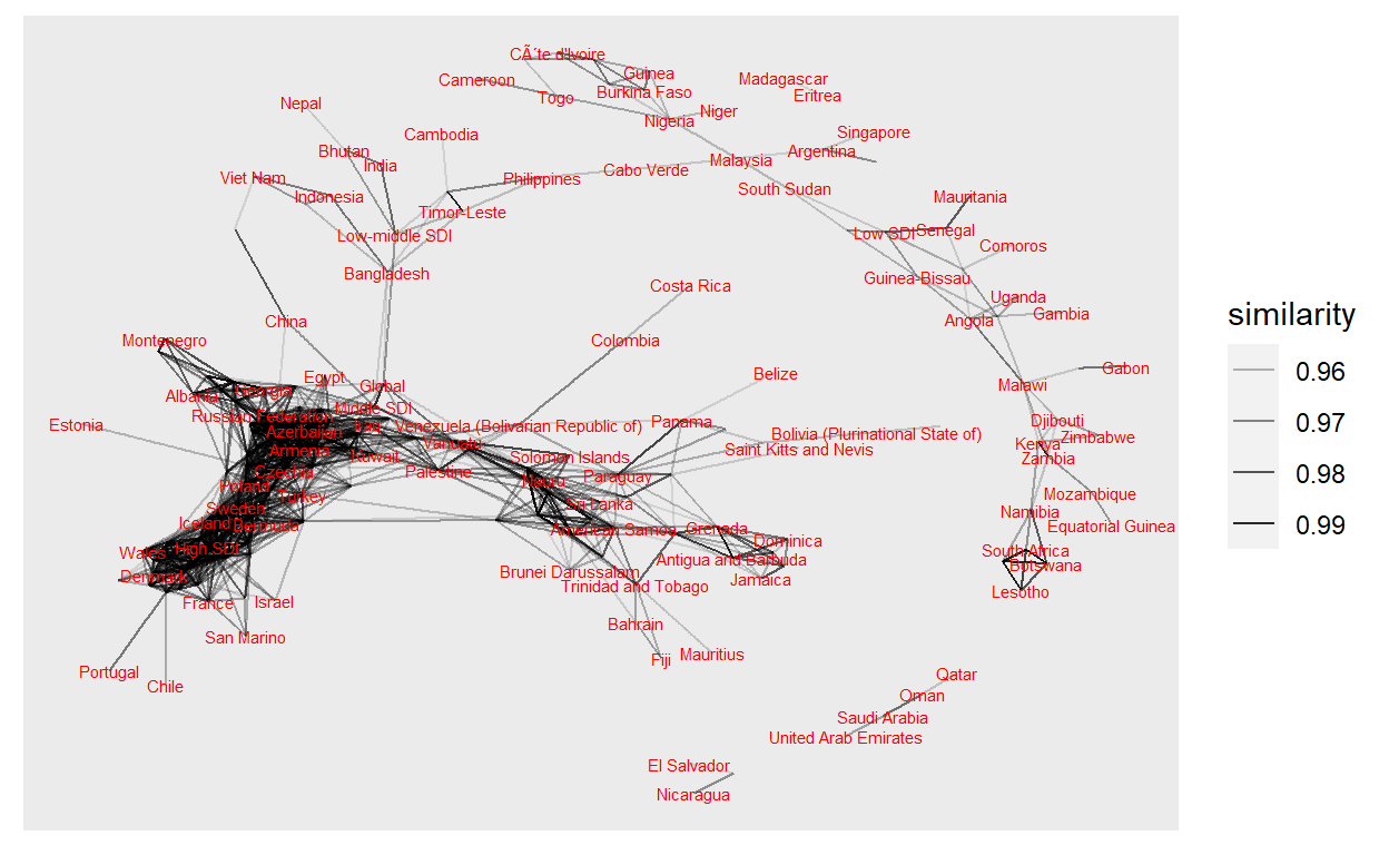
This was just to show how quickly you can generate a plot using {widyr} and {ggraph}. This probably has too much information in it, but we can already see some interesting trends and connections between states which share different health issues.
Final remark
I hope this post has sparked some curiosity in you to use the ggraph package. Although the data structure with edges and vertices is somewhat new, it is all about getting used to this format and soon you will create better and better visuals. And remember: You do not have to learn everything on the first day or with the first visual. Repeat and add small pieces of knowledge to your toolbox every time you come across interesting data.
Again, check out the website of the package for many more examples.